Guide to Using Cyclone Database Products
Products
Getting Started
 |
1. North Atlantic Cyclone Database products can be found at the 'Products' link above.
2. The menu bar on the products page has two drop-down menus, for selecting 'Run' time (left), covering the last 15 days, and 'Product' type (right). There are also links to the ECMWF home page (icon top left) and to this help page (top right). Two arrow buttons in the centre provide a quick way of changing run time, the left arrow steps down the run time list (ie to earlier times), the right arrow steps up, to later times.
3. To quickly view past evolution use the arrow buttons to step through time. Provided ‘Clickable control T+0 image’ is the selected product, this action will show successive T+0 control forecast analyses.
4. There is also an archive of older North Pacific products, provided for the TPARC experiment, available via this TPARC web page: there is one link for Winter TPARC (2009), and one for Summer TPARC (2008). Some more recently developed products are missing from this archive.
Overview
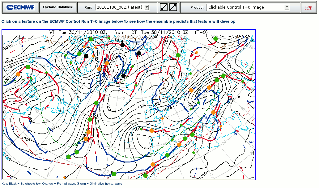
These web-based products aim to represent, objectively, the location and behaviour of near-surface synoptic scale features, in the ensemble and deterministic forecasts, in a variety of ways. The features represented are those typically associated with adverse weather:
-fronts, warm and cold, shown as lines
-cyclonic features, shown as spots, consisting of:
-Barotropic Lows
-Frontal Waves
-Diminutive Waves
A smaller spot (for Frontal waves and Diminutive waves only) denotes when the related front is associated with a less pronounced thermal gradient.
All cyclonic features are kept 300km or more apart, using co-location masking, based on a feature type hierarchy, and a minimum separation threshold.
Mean sea level pressure (mslp), as estimated from 1000mb geopotential height and temperature, is also shown on many plots.
1000-500mb thickness is shown on some plots using conventional colours.
On some plots precipitation totals and dominant precipitation type are also shown (see item 8 below for details).
The product suite relies on each cyclonic feature being represented by a row in a database. Each column then represents an attribute, such as 'latitude of the feature' (intrinsic) or 'mean sea level pressure at feature point' (extracted from model fields). Products rely on displaying these attributes in different ways.
A new tracking algorithm has been used to follow the cyclonic features as they evolve in each ensemble member. This is based on the following:
- past feature movement if available
- the 500hPa wind over the feature (steering wind)
- type of transition (eg using the fact that 'frontal wave' to 'barotropic low' is relatively common)
- 1000-500hPa thickness change over the feature
Resolution
The time step between frames used in constructing the cyclone database, and on the products themselves, is 12 hours. This was set so as to ensure timely product delivery. Data fields from both determistic and ensemble runs are reprojected onto a 50km grid at the outset, because the focus here is on synoptic scale systems rather than fine mesoscale detail. This is still sufficient however for minor frontal waves to be identified and tracked.
Products and How to Use Them
Sub-section titles below are in red; these replicate items on the 'Product' dropdown menu. Miniature product examples are shown alongside (click to enlarge).
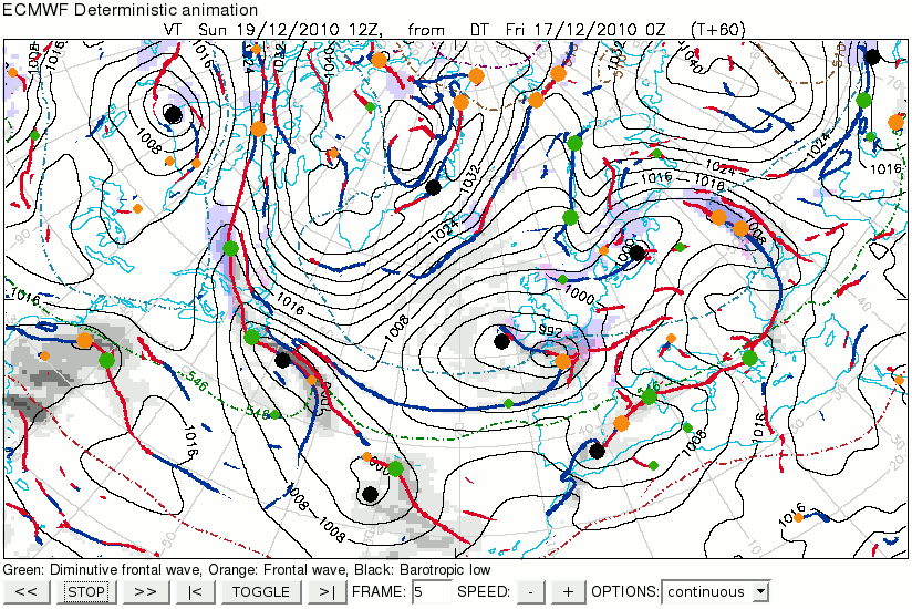
- This is akin to a synoptic analysis chart.
- The user can click on any cyclonic feature spot, to see how that feature behaves within the ensemble .
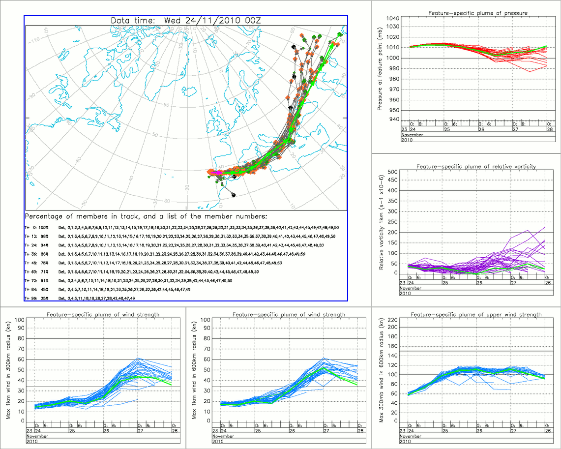
- Clicking brings up a track map, and five feature plume diagrams relating to feature intensity (see image below).
 |
Explanation
(follow numbered boxes in order)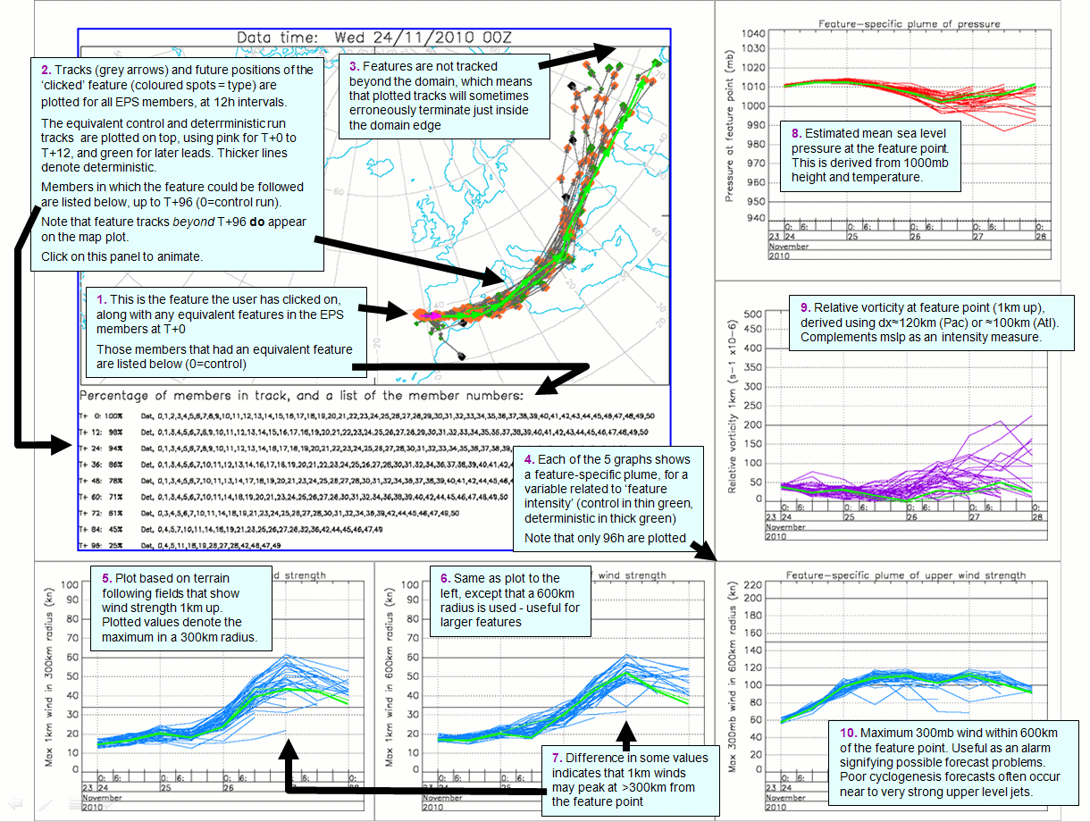 |
- Note that the control run is shown in thin green, the deterministic in thick green. The one exception to this is on the track map where magenta replaces green for the first time step, to guide the eye.
- Take care to note the percentage of EPS members in which the feature has been tracked (tabulated).
- Subsequently clicking on the track map will show an animated version..
 |
- When running the track animation, the bar on the right denotes percentage of members in which the feature has been tracked. If >50% then the bar is green - feature track probably OK. For 10-50% it becomes orange - caution required, feature may not persist to this point. For <10% it becomes red - considerable caution required - feature very unlikely to persist to that point.
- Do not neglect the smaller spots - sometimes these evolve into substantial cyclones.
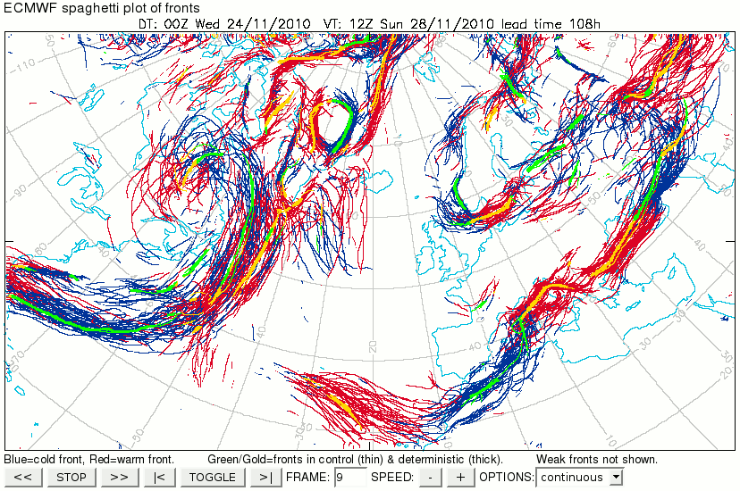 |
2. ‘Fronts animation’ |
- Objective warm and cold fronts from each ensemble member are overlaid (red and blue respectively). To avoid cluttering, those fronts that meet just weak thermal gradient threshold criteria are not included here (though these are shown on synoptic chart animations in item 7).
- Control and deterministic run fronts (warm in gold, cold in green) are plotted on top, using thin and thick lines respectively.
- Animating tends to show increasing spread with increasing leads, and also how some fronts are more predictable than others at a given time
- The degree of spread can be used to attach confidence to any deterministic point forecast of front-related weather
- A new predictability limit could be defined to be where all synchroneity between EPS members’ fronts is lost.
- The degree of agreement between the deterministic run and the rest of the ensemble indicates the extent to which the deterministic might be used as a first guess, at least for placing fronts.
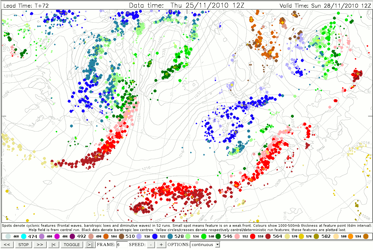
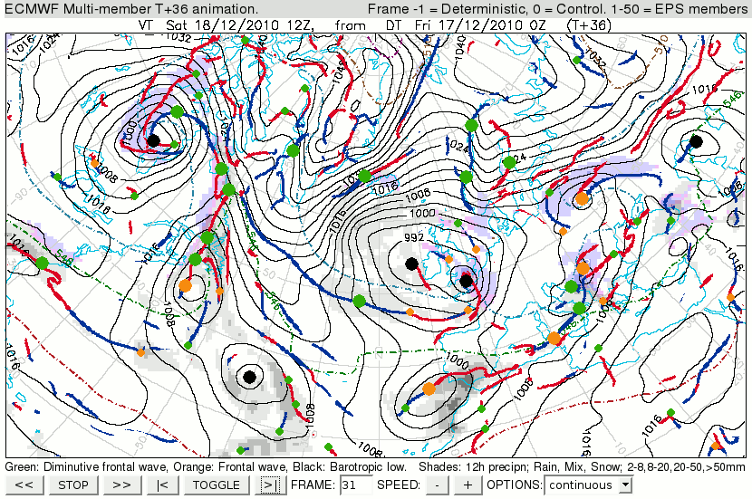
'Dalmatian charts' (=feature animations)
In constructing each product in section 3 the EPS members are plotted first, followed by the control then the deterministic runs. Highlighters for the control (yellow circles) and deterministic runs (yellow crosses) are added last of all. The aim with each animation is to compress a huge amount of ensemble information into key elements that relate to adverse weather, and that can be visualised on a single plot. 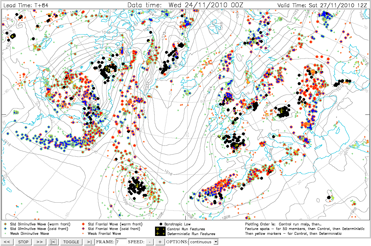 |
3.1 ‘Features animation’ |
- Feature points from all model runs are shown, along with the control run mslp field.
- Legend below the plot denotes the meaning of each symbol type:
- Green is used for diminutive waves, Orange for frontal waves and Black for barotropic lows.
- A central Blue spot denotes features on cold fronts, whilst Red denotes features on warm fronts.
- Animating shows increasing spread with increasing lead, and also how some features are more predictable than others at a given time
- The degree of spread can be used to attach confidence to any issued forecast of feature-related weather
- The degree of agreement between the deterministic run and the ensemble indicates the extent to which deterministic guidance might be followed as a most probable outcome, at least for placing cyclonic features
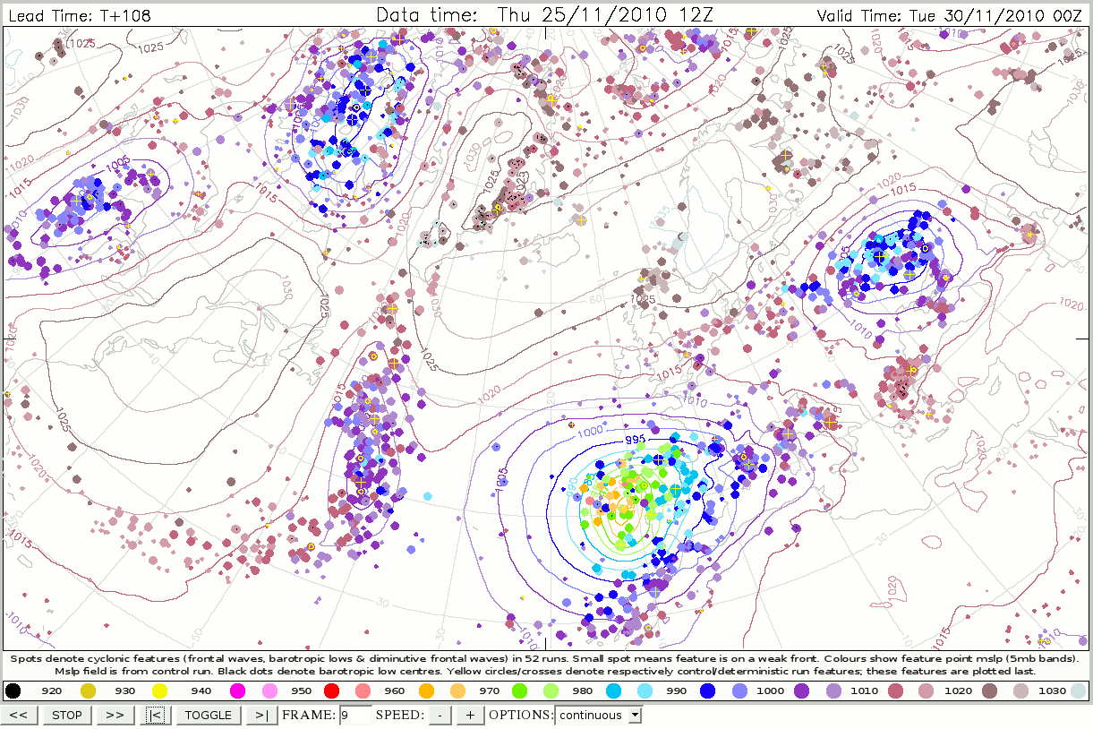 |
3.2 ‘Feature anim (mslp)’ |
- As for item 3.1 above, except that spot colour denotes mean sea level pressure at the feature point, according to the colour scale below.
- The colour scale was designed so that brighter colours signify lower pressure. Note that away from the extremes colours are divided into 10hPa bands (eg blue for 990-1000hPa), with 5hPa subdivisions wherein a lighter shade signifies the upper half (eg light blue for 995-1000hPa), and a more intense shade the lower half (eg bright blue for 990-995hPa).
- The control run mslp field is also shown, using colours that correspond with the lower end of a colour's range.
- A black dot in the middle of a feature point signifies a barotropic low, which is therefore guaranteed to be a low centre.
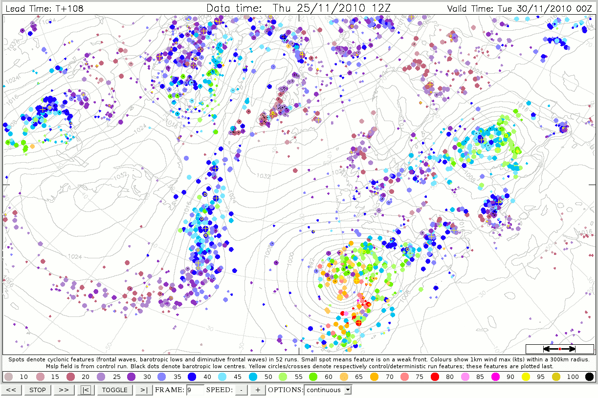 |
3.3 ‘Feature anim (300km 1km wind max)’ |
- As for item 3.1 above, except that spot colour denotes the following feature attribute: the maximum wind strength present within a 300km radius of the feature point, on a terrain-following surface at 1km altitude.
- The scale below shows colour meaning; brighter colours are for stronger winds.
- If an airmass is unstable wind gusts at the surface may be similar to the '1km wind', so the colour can give a rough idea of the maximum gust possible at the surface. In a stable airmass it is likely to provide an over-estimate.
- Note that surface gusts can also be increased by convection, and can also be increased or decreased by topographic effects that may or may not be captured, so the colour scale should only be used as a rough guide.
- Note also that strong winds may be concentrated on only one side of the low track, on the other side strength may be much lower than shown.
- The span of a 300km radius ring is shown, approximately, by the scale in the lower right corner.
- For larger cyclones the strongest winds may be more than 300km from the feature point, for which Product 3.4 will be more useful.
- A black dot in the middle of a feature point signifies a barotropic low.
- Contours show control run mslp.
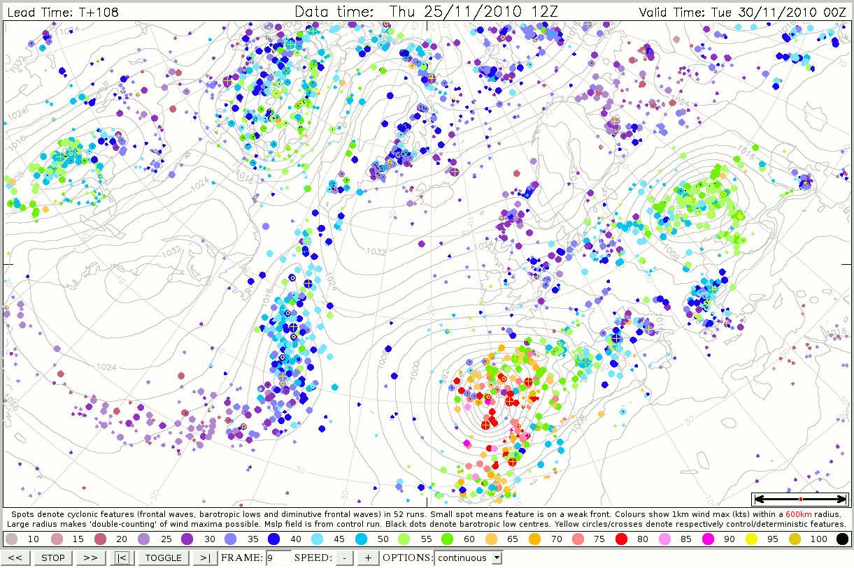 |
3.4 ‘Feature anim (600km 1km wind max)’ |
- As for item 3.3 above, except that a 600km radius is used to search for the maximum 1km wind.
- This product is more appropriate for large cyclones; the downside is that there is more chance of 'double counting' of a single wind maximum, as signified by two close features in the same EPS member appearing the same colour.
- The span of a 600km radius ring is shown, approximately, by the scale in the lower right corner.
- Contours show control run mslp.
 |
3.5 ‘Feature anim (thickness)’ |
- As for 3.1 above, except that spot colour denotes 1000-500hPa thickness at the feature point, according to the colour scale below (standard colours used).
- Provides a measure of tropospheric temperature at the feature points.
- Can be useful for identifying snow-bearing, as apposed to rain-bearing systems
- Note that by construction cyclonic features are commonly located in relatively warm air. This is especially true for frontal waves and diminutive waves. This is because they reside on fronts, and fronts are located on the warm air side of baroclinic zones. So in the cold sector around a cyclonic feature the thickness may be much lower than the spot colour signifies.
 |
4 ‘Postage stamps Animation’ |
- Self-explanatory. Can be easily animated. Weak fronts and weaker (small spot) frontal waves and diminutive waves have been omitted. Deterministic and control forecasts are shown in the top left.
 |
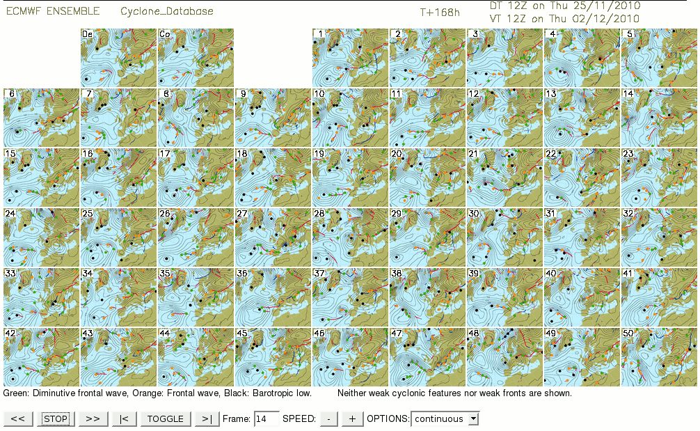
5 ‘Postage stamps (detailed)’ |
- A large volume of data; can take time to load. Every time frame from every ensemble member is shown in postage stamp format.
- All synoptic features, and both weak and standard fronts are shown.
- Three types of link can be initiated from here (also available from the drop-down menu above):
- (1) Clicking on a stamp brings up the full size version of that image in a separate window.
- (2) Clicking on a member number (LEFT) reverts the current window to show an animation of that member (item 7).
- (3) Clicking on a lead time (TOP) opens up a new tab showing clickable postage stamps from all members for that lead time only (item 6).
 |
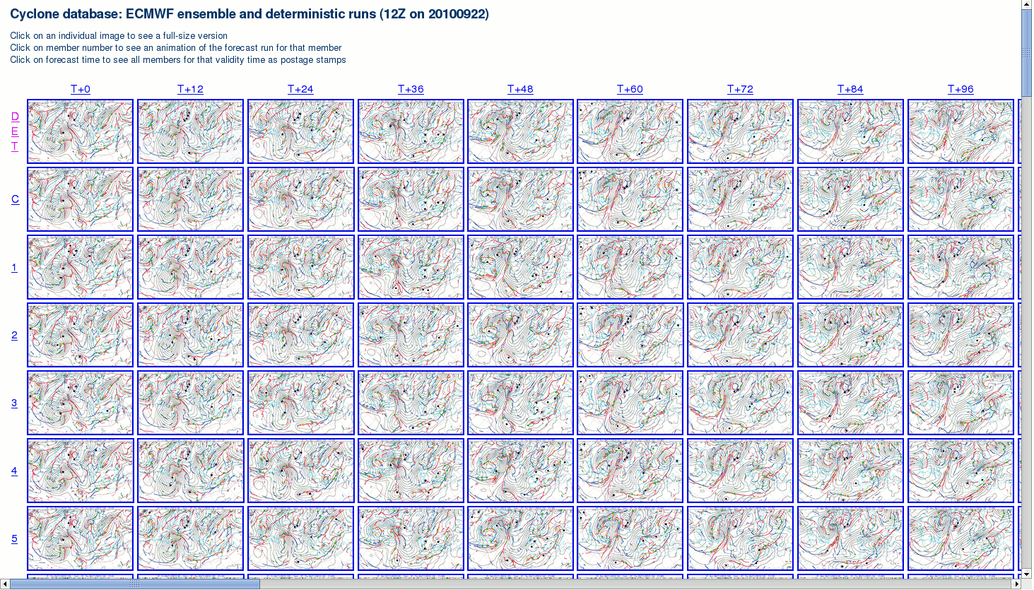
6 ‘Postage stamps (detailed, times)’ |
- Clickable, relatively large T+0 postage stamps from each member, showing all synoptic features
- Page size designed to fit neatly onto a standard large screen (19’, 1280x1024), without needing scroll bars (works provided number of menu bars used is limited)
- No animation, but navigation buttons in lower right corner assist with moving between validity times
'Strike probabilities'
These products are somewhat analagous to the strike probability or 'cone of uncertainty' charts often used to display forecast tracks of tropical cyclones. However there are three main differences. Firstly, the strike probability charts are not cyclone-specific. All cyclonic features, for whom a particular attribute meets a pre-defined threshold, are represented on a single frame, wherever they are in the domain. Secondly, a feature need not be in existence at time zero. Provided the feature exists at the nominal frame time (and meets the threshold criteria) it will be represented. And thirdly, each frame represents only a time window of +/-12h relative to nominal frame time. We represent the full track, within this time window, of features that meet the threshold criteria at least once within that time window. Strike probability map construction is explained at the link below (animated):
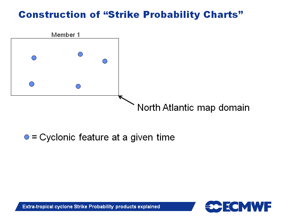
It is important to not confuse strike probability with the likely location of wind maxima. What isrepesented is not the tracks of the wind maxima themselves, but the tracks of those features whose wind attributes exceed a certain threshold. In practical terms this means that if we have a localised high strike probability for a windstorm that is moving east, then it is somewhere to the south of that strike probability maximum that will most likely see the strongest surface winds, as the strongest winds commonly occur on the southern flank of such cyclones. Of course the picture becomes distorted if the local topography is complex, or if the cyclonic feature has an atypical structure.
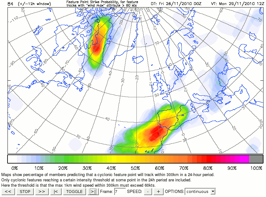 |
7.1 ‘Strike probs (1km wind > 60kn)’ and other thresholds |
- Shows strike probabilities of a cyclonic feature track passing within 300km, within a time window of +/-12 hours relative to frame time
- Based on diagnosed tracks of cyclonic features, at all times, in all members
- No minimum track time threshold is applied - so an untracked (single time) feature will contribute a circle (on this projection) to the strike probability
- Thresholding is applied based on the time window -12 to +12h, specifically the maximum-300km-radius-wind, 1km up, registered within this. Hence the ‘>60kn’ threshold nominally represents ‘cyclonic windstorms’. Moderately vigorous features are denoted by the ‘>34kn’ threshold.
- The ‘all features’ option uses no thresholding.
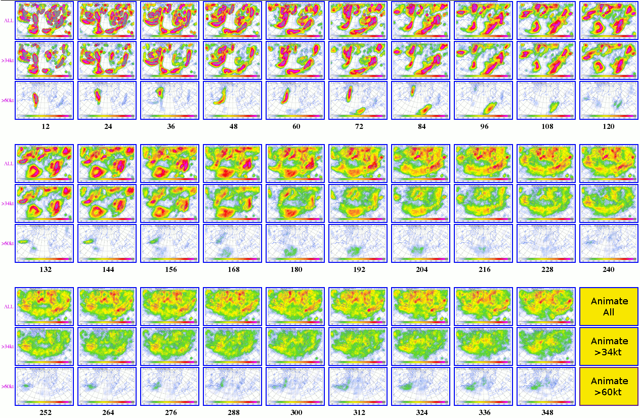 |
7.2 ‘Strike prob Postage stamps’ |
- Allows quick and easy access, in postage stamp format, to all the frames from the strike probability animations. Click on a postage stamp to view a larger version.
- Lead times are shown in black, thresholds in purple.
- Also provides links to run each of the strike prob animations in a separate window (yellow boxes)
- Used in conjunction with the arrows on the top menu bar one can see how the forecast for a particular stormy period has evolved with time (recognising of course that lead time for a given day changes as the data time changes).
 |
8 ‘Animation of control’, ‘Animation of member 1’, ..etc.. |
- Fairly self explanatory. All cyclonic features and fronts are shown, from one EPS member, in animation format.
- Mslp and thickness from each member are also included.
- Shading denotes ppn totals in a 12h period spanning the frame time (-6h to +6h in relative terms):
- Blue shades denote snow (>75% of the ppn total in the period is diagnosed to be snow)
- Pink shades denote mixed ppn (25-75% of ppn in the period is diagnosed to be snow)
- Grey shades denote rain (<25% of ppn in the period is diagnosed to be snow)
- Ppn totals are all converted to mm rainfall equivalent prior to computing percentages.
- Shading intervals for all types are as follows:
- 2-8mm rainfall equivalent
- 8-20mm
- 20-50mm
- >50mm
- Precipitation data is extracted on a 50km grid
- For the mixed ppn type in particular note that there are several ways in which one might see a certain percentage of snow, for example there could be mixed phase precipitation for the whole period, or alternatively rain turning to snow, or snow turning to rain.
- Try increasing the animation speed. ‘Toggle’ is also useful in static mode.
 |
9 ‘ T+0 'animation' ’, ' T+12 'animation' ’, ..etc.. |
- 'Fixed time' animations. May take some time to load due to the number of frames.
- Allows the user to view all members for a given time. Image contents are as in item 8 above.
- By referring to the frame number in the bar below one can identify which member the image corresponds to, and then, if required, the user could view an animation from just that member (via item 8 above).
- Particularly useful for assessing confidence in a given synoptic feature, and its associated weather, at reatively short leads, or variations in general synoptic pattern at longer leads.
- Differences at T+0 show the effects of perturbations (including the impact of ensemble data assimilation (EDA)).
Accuracy
Identifying and tracking extratropical cyclones is a complex process, particularly when one is also accouting for less easily discernable features such as frontal waves. The accuracy of the identifying and tracking algorithms used here compares very favourably with other published methods. Nevertheless there will be occasions when the behaviour of a cyclonic feature in one or more members, as represented in particular on feature track and plume diagrams in item 1 above, does not tally with a subjective interpretation of the input data (as represented in item 8). Sometimes there are errors, due to difficulties inherent in tracking. But equally what appears to be an error can sometimes be due to the eye perceiving an evolution that is not happening in reality. For example if the track of a feature is curtailed, it may be because of downstream development, where a low fills in situ, and another one develops downstream, such that for some short intermediate time span there are actually two centres in the model fields.
Erratic track behaviour can also arise in some situations where there is ambiguity regarding which of two subsequent features one initial feature evolves into. In such situations there may appear to be very large (even bimodal) spread in the feature tracking which will not just reflect a large EPS spread, but will rather reflect the tracking ambiguity.
When using the track and plume diagrams the user should generally follow the majority, and reject clear outliers. At the same time however they should be alert to the fact that in dynamically unstable situations what appears to be an extreme outlier, in terms of depth, track etc, may turn out to be correct. And the tracks should, as far as possible, be viewed alongside the synoptic evolution of a representative member (item 8) to ensure the correct interpretation is being made.
Note also that the strike probability maps (item 7) tend to give a visual impression that inherently foccuses on the majority view, so these should also be utilised at short leads, alongside the other products.
Further Reading
Hewson, T.D., 1997: Objective identification of frontal wave cyclones. Meteorol. Appl., 4, 311-315.
Hewson, T.D., 1998: Objective fronts. Meteorol. Appl., 5, 37-65.
Hewson, T.D., 2009: Diminutive frontal waves - A link between fronts and cyclones. J. Atmos. Sci., 66, 116-132.
Hewson, T.D., 2009: Tracking fronts and extra-tropical cyclones. ECMWF Newsletter, No. 121, 9-19.
Hewson, T.D. & H.A. Titley, 2010: Objective identification, typing and tracking of the complete life-cycles of cyclonic features at high spatial resolution. Meteorol. Appl., 17, 355-381.